Add Chart in Salesforce Report:
| Read Before Proceed: (1) How to Create a Report in Salesforce (2) Add Groups and Columns in Report in Salesforce |
(1) In this blog, we will learn how to add a Chart to the Salesforce report.
(2) In this example, I have added a chart to the existing Salesforce report.
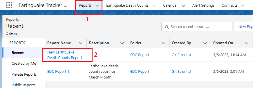
(3) First of all, go to the Earthquake Tracker App and click on the Reports tab. I have selected the existing report from here as shown below.
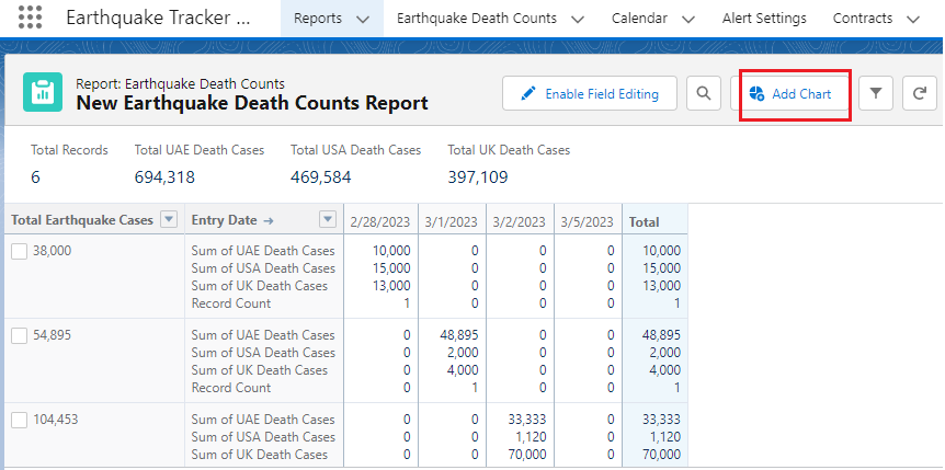
(4) Report is getting opened. Now click on the Add Chart button as shown below.
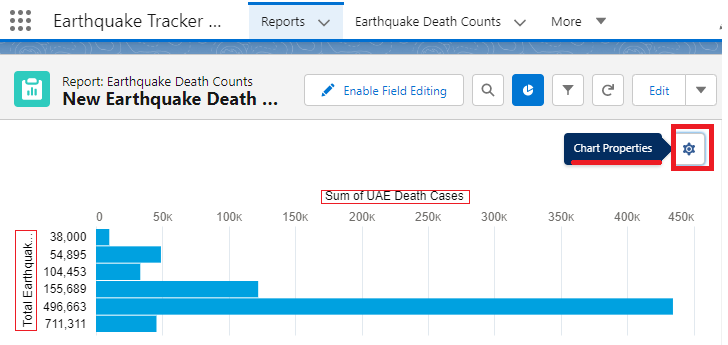
(5) Chart is added to the report. If you click on the Gear icon, you see the chart properties as shown below. Below Bar chart shows the sum of UAE death cases.
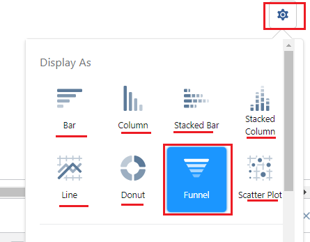
If you want to see the Funnel chart report click on the chart properties icon and select from here Funnel as shown below.
The below Funnel chart shows the sum of UAE death cases.
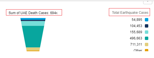
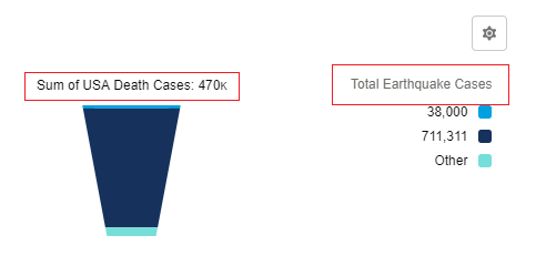
If you want to see the funnel chart report for the sum of USA death cases, click on the chart properties icon and scroll down, you find Chart Attributes. In the Value field, select the sum of USA death cases. When you select that value, it shows a Funnel report for the sum of USA death cases as shown below.
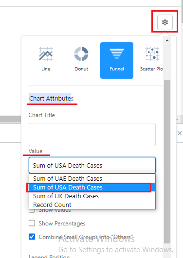
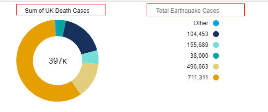
From the Chart properties, you can display reports in the bar, column, stacked bar, stacked column, line, donut, funnel, and scatter plot.
Example of Donut Chart Report:







Comments (No)